Analysis Over Time
One of the core objectives of QRiS is to observe and analyze changes in river health metrics over time. The Analysis over Time tool allows users to visualize and analyze how river health metrics have evolved across different time periods. This tool is essential for understanding trends, identifying patterns, and making informed decisions about river management and conservation efforts.
Before using the Analysis over Time tool, users will need to have created and populated an
Opening the Analysis Over Time Tool
The Analysis over Time tool operates on an existing QRiS Analysis. To open the tool, right click on an analysis in the QRiS Project Tree and select "Analysis Over Time". This will open a new docked window below the main map canvas.
The left side of the panel contains the Chart Inputs and Data Capture Events tabs. The right side of the panel contains the chart itself.
Chart Inputs
The Chart Inputs tab allows users to select the river health metric they wish to analyze over time.
- Analysis: This dropdown allows users to select which analysis they want to analyze over time. The Analysis that was initially used to open the Analysis Over Time tool will be selected by default.
- Metric: This dropdown allows users to select which river health metric they want to analyze over time.
- Mask Polygon: This dropdown allows users to select a mask polygon (Sample Frame, AOI or Valley Bottom Polygon Feature) to apply to the analysis.

Below these dropdowns is an "Interactive Map" checkbox. When this is checked, the map will update to show the mask and DCE layers related to the selected metric. This allows users to interactively explore the spatial distribution of the metric values for each time period. When unchecked, the map will not update when different metrics or mask polygons are selected.
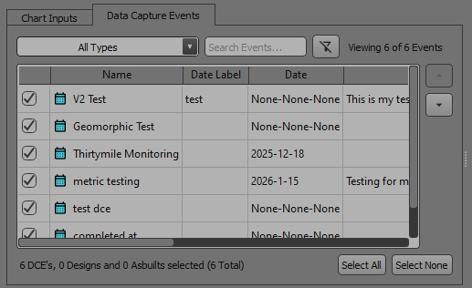
The Data Capture Events tab allows users to select which events they want to include in the chart. The events are initially loaded based on the properties of the selected Analysis. This control allows you to select, deslect and reorder the events that are included in the chart. Changes made in this tab will directly affect which events are displayed along the x-axis of the Analysis over Time chart.
Analysis over Time Chart
The chart on the right side of the panel will update based on the selections made in the Chart Inputs and Data Capture Events tabs. The x-axis of the chart represents time (Data Capture Events), while the y-axis represents the values of the selected river health metric. Each data point on the chart corresponds to a different event, allowing users to compare how the metric has changed across different events over time.
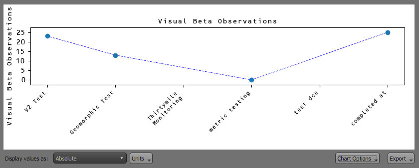
You can click on a data point on the chart to open the Metric Value form for that metric value, which allows you to quickly edit the metric value as well as the uncertainty associated with that value.
Below the chart are controls that allow you to change the Display Values as well as the units in the chart. Display values can be set to:
- Absolute: This will display the absolute values of the metric for each event.
- Relative to Minimum: This will display the values of the metric for each event relative to the minimum value across all events.
- Relative to Maximum: This will display the values of the metric for each event relative to the maximum value across all events.
- Relative to Mean: This will display the values of the metric for each event relative to the mean value across all events.
The Chart Options button has menu options that allow you to set:
- Chart Font: This allows you to overide the QRiS settings and specify the font used in the chart.
- Show Uncertainty: This option allows you to toggle the display of uncertainty bars on the chart, which represent the uncertainty associated with each metric value.
- Show Trendline: This option allows you to toggle the display of a trendline that connects the data points on the chart.
The Export button in the lower right corner of the chart allows you to export the chart as an image or export the underlying data values. Exporting the chart as an image will allow you to save the chart in png, jpeg, or svg format. Exporting the chart values will allow you to save the underlying data in csv, json, or excel format.